Mar 12, 2024
Power BI custom visuals: 5 charts to elevate your data storytelling
3-MINUTE READ | By Ralph Spandl
[ Updated Mar 12, 2024 ]
While many data reporting platforms excel at loading and transforming data, their visualization capabilities often need to be broadened with a handful of chart types.
Bringing marketing data to Power BI is a great way to visualize data and communicate insights. While common charts like bar charts, line charts, and scorecards are sufficient for most reporting needs, you can elevate your data storytelling using custom visuals.
In this post, I’ll discuss five custom charts to show the great variety available.
Navigate this post:
- Power BI custom visuals are becoming more popular
- Tornado chart
- Tile grid map
- Gantt chart
- Chiclet slicer
- DENEB
Power BI custom visuals are becoming more popular
If you’re anything like me and enjoy following the latest developments of the Power BI community, you’d have noticed that many third-party providers have been introducing more custom visuals for the past 18 months. This trend happened for a couple of reasons.
First, custom visuals are tightly integrated into the main product and feel like native components. Developers enjoy access to a comprehensive API that allows them to construct data and style panels akin to native visuals, integrate native tooltips, incorporate conditional formatting, and facilitate drill-down functionalities.
Additionally, Power BI requires all submissions to AppSource to have a full set of features, including tooltips that appear when you hover over something and the ability to filter data. This ensures that all apps maintain a certain level of quality.
Microsoft’s decision to introduce new charts exclusively through AppSource rather than expand the native list underscores its active involvement in nurturing the custom visual ecosystem. This highlights how important custom visuals are, making them essential in reaching Power BI’s full potential.
However, I think the game-changing move was when Microsoft allowed users to purchase licenses directly on their platform in 2022. This led to a surge in submissions to AppSource, meaning the catalog is now quite comprehensive.
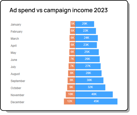
Tornado chart
Let’s begin with a straightforward example—the Tornado chart. Primarily, you can use this chart to visualize demographic data, such as gender distribution across different age groups. This chart can also be relevant in marketing data visualizations.
Let’s say you want to visualize marketing expenditure vs. income. While a grouped bar chart could serve this purpose, the tornado chart offers a distinct advantage. It clearly shows how income and expenditure patterns have evolved over time.
Rather than focusing solely on direct comparison, this chart emphasizes the pattern of each metric, providing a deeper understanding of the data narrative. Despite its simplicity and limited options in the visualization pane, the tornado chart is a must-try if you just start to explore custom visuals.
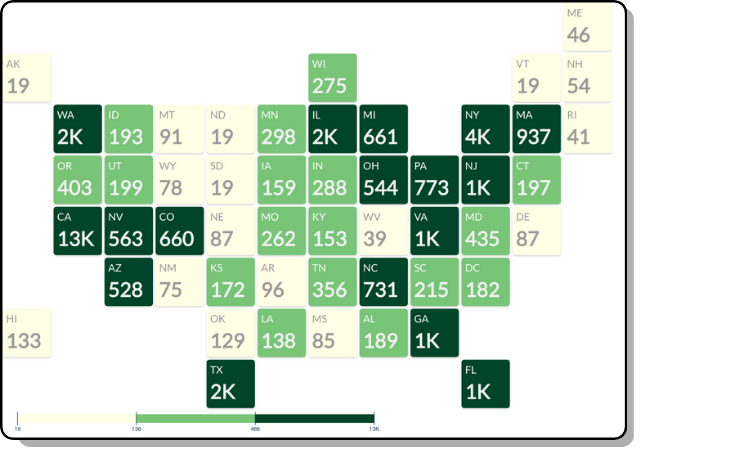
Tile grid map
Next is the tile grid map by Supermetrics. It presents geographic regions using tiles of equal size, regardless of their geographical location. By representing each region with uniform-sized tiles, it makes sure that large regions don’t dominate the map and smaller regions are visible. This way, you’ll get a balanced view of your data.
This chart is especially useful for making alternative maps, such as the United States, to deal with problems like the uneven geographical sizes of states.
Let’s say you want to check website visits from each state. Using a quantile color scheme, you can use a title grid map to categorize data into performance groups. This way, you can effortlessly filter the dashboard to focus on specific performance groups using custom visual filter capabilities. Additionally, with the paid version, you can create your own tile patterns that are adapted to your needs.
You can use the basic version of this chart for free. However, you’ll need a license if you crave advanced features such as small multiples.
Gantt chart
Marketers love using Gantt charts to plan and track marketing campaigns. With over 15 variations available in the Power BI Marketplace, you can choose the options that suit you best.
While Microsoft’s free Gantt visual provides a basic solution, it lacks flexibility and space-intensive design. You may look into alternatives like MAQ Software’s version. Try out some of the other visuals available depending on your specific needs.
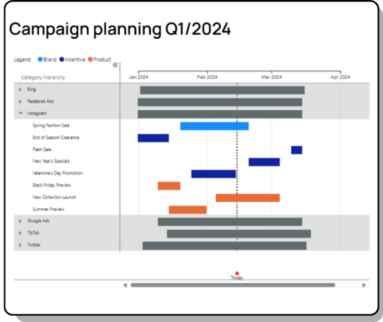
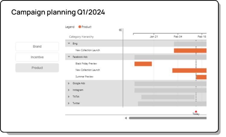
Chiclet slicer
In Power BI, slicers serve as interactive filters placed on the canvas, allowing users to interact intuitively with reports.
With the chiclet slicer, you can make your filter more visually appealing. For example, using different colors, layouts (rows, columns, matrices), and even image inclusion from your dataset.
The following illustration shows how a slicer can effectively filter a Gantt chart to display only product campaigns, streamlining data exploration and analysis.
DENEB
The previous examples show that, on the one hand, most custom visuals are relatively easy to use, but on the other hand, their capabilities are always limited, and their styling heavily depends on the decisions of their visualization designer.
Finally, we have DENEB, a novel addition to Power BI’s custom visual collection. Unlike conventional visuals, DENEB serves as a system for integrating Vega or Vega-Lite visualization into Power BI. With the Vega libraries, users can create visuals by describing them in JSON format. This is easier than programming them in JavaScript, but you still need to know what you’re doing.
With DENEB, you’ll have more flexibility in creating visuals. However, it has a steep learning curve, and you should be familiar with Vega and Vega-Lite.
To get started, DENEB offers some visualization templates you can download and import into the visual. There is, however, very little documentation available for these templates, and finding the one that fits your dataset and visualization needs can be a challenge.
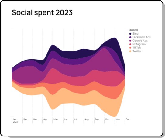
If you’re comfortable with using advanced visuals, DENEB offers endless opportunities to customize your visuals. For example, you can create a steam graph illustrating annual ad expenditure across various channels. This steam graph makes it easy to see how ad spending changes throughout the year. You can clearly see the spending spike in May and the gradual increase in early Q4.
Some caveats
You’ll find a lot of visuals in AppSource, but it’s important to remember that not all visuals can enhance your data narrative. It’s all about choosing what serves your visualization goals.
For those striving for cohesive graphic standards, certain visuals may appear overly opinionated, potentially disrupting the overall coherence of your report.
Keep in mind that each visual comes with its own learning curve. I recommend you try different styling techniques and use different datasets to familiarize yourself with the visual’s nuances.
About the author

Ralph Spandl
For years, Ralph has had a soft spot for data visualization, which he eventually centers his professional career around. He's the Head of Data Visualization at Supermetrics, where he built the first commercial Looker Studio chart library. Ralph also hosts multiple webinars and writes articles about data visualization. Before Supermetrics, he founded r42, which slowly became a web agency with a nice portfolio of companies working in the financial, industrial, and leisure sectors and a few non-profit organizations.
Turn your marketing data into opportunity
We streamline your marketing data so you can focus on the insights.